Enterprise Web Component · Case Study

Interactive Timeline Component System

Designing and building a modular, accessible, brand-adaptive timeline system for two of South Florida's leading healthcare organizations.

Clients Baptist Health SF & UHealth
Duration 8 Weeks, Multi-Phase
Role Lead Developer & Designer
Type Component Design & Dev
Scroll
01 Intro Problem, Audience & Context 02 Content Process, Methods & Deliverables 03 Closure Impact, Challenges & Learnings
Intro Process Methods Deliverables Impact Challenges Learnings

Two clients. One system.
Zero room for sameness.

Baptist Health South Florida's original timeline was static, text-heavy, and visually flat. Users scrolled through long blocks of content with no interaction or engagement. When University of Miami's UHealth system requested a similar component — but with multiple events per year organized by month — the architecture itself had to evolve. A simple visual reskin wouldn't cut it.

🎯

The Problem

The existing timeline was functional but forgettable — walls of text with no visual hierarchy, no interactivity, and no mobile optimization. With 60%+ of healthcare site traffic on mobile, this was a critical gap. I needed to build an interactive storytelling experience that was fully WCAG 2.2 compliant, mobile-first, and flexible across two distinct brand systems.

👥

The Audience

Primary users were prospective patients, donors, and community members exploring institutional history. Secondary users were internal staff using timelines for onboarding and presentations. Both groups needed clear navigation, reduced cognitive load, accessible interactions, and engaging visual storytelling.

From stakeholder alignment
to shipped components

I owned every phase — research, wireframing, UX architecture, front-end development, accessibility compliance, animation logic, and brand integration.

1

Discovery & Stakeholder Alignment

I started by analyzing existing timeline content and interviewing stakeholders to understand what stories mattered most, how they wanted the organization positioned, and what success looked like. This ensured the component served strategy — not just design.

2

High-Fidelity Wireframing (Before Code)

Before writing a single line of HTML or JavaScript, I built detailed Figma wireframes. This allowed early stakeholder feedback, faster iteration cycles, and reduced development rework. This decision alone saved significant revision time later in the process.

High-fidelity Figma wireframe showing the zigzag timeline layout with year markers and expandable card structure for Baptist Health.

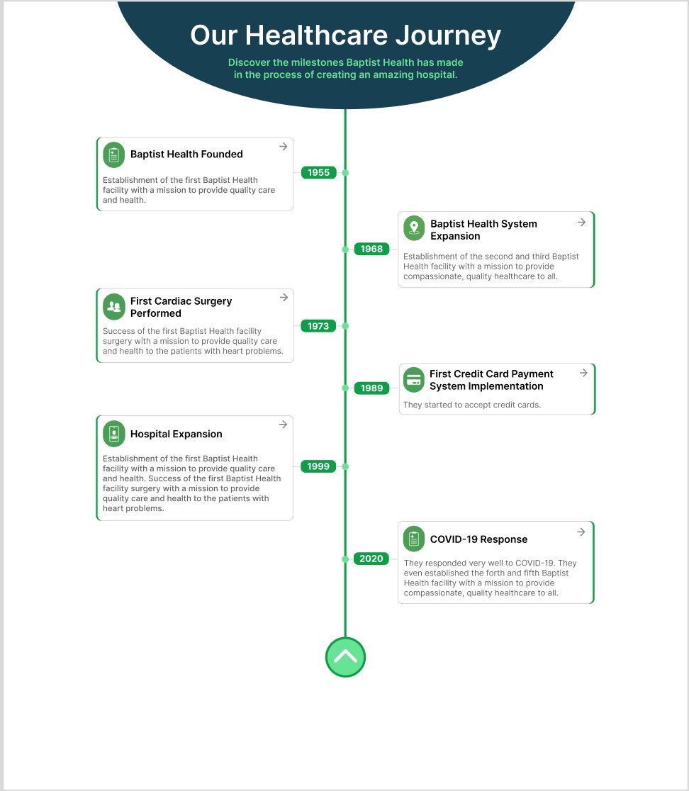
Figure 1 — High-fidelity Figma wireframe establishing the zigzag layout, year markers, and expandable card structure.

3

Component Variations & Decision Framework

Rather than delivering one solution, I presented four expandable card variations — with and without icons, with and without CTA buttons, and at different content densities. This turned subjective preference into structured decision-making. Instead of "Do you like it?" — it became: "Which feature set best supports your content strategy?" That shift elevated the conversation from visual preference to UX strategy.

Four component variations with different feature combinations presented to stakeholders for structured decision-making.

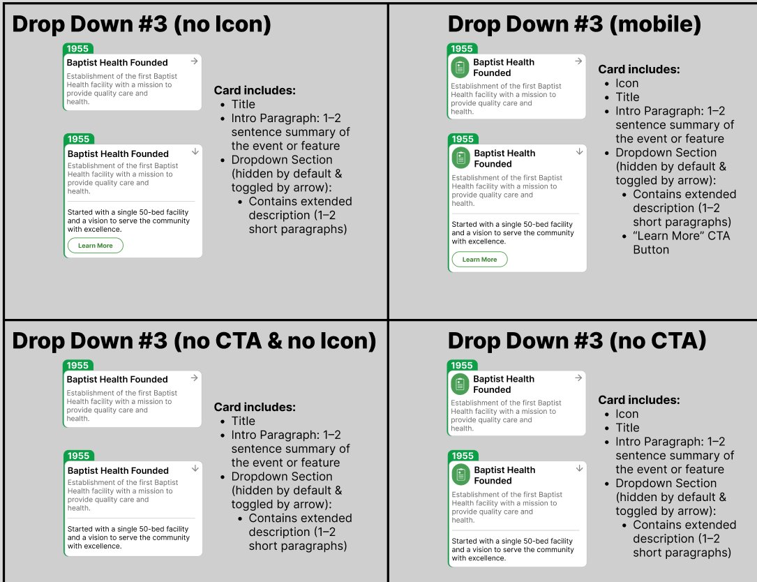
Figure 2 — Four component variations presented to stakeholders for structured decision-making.

4

Development Architecture

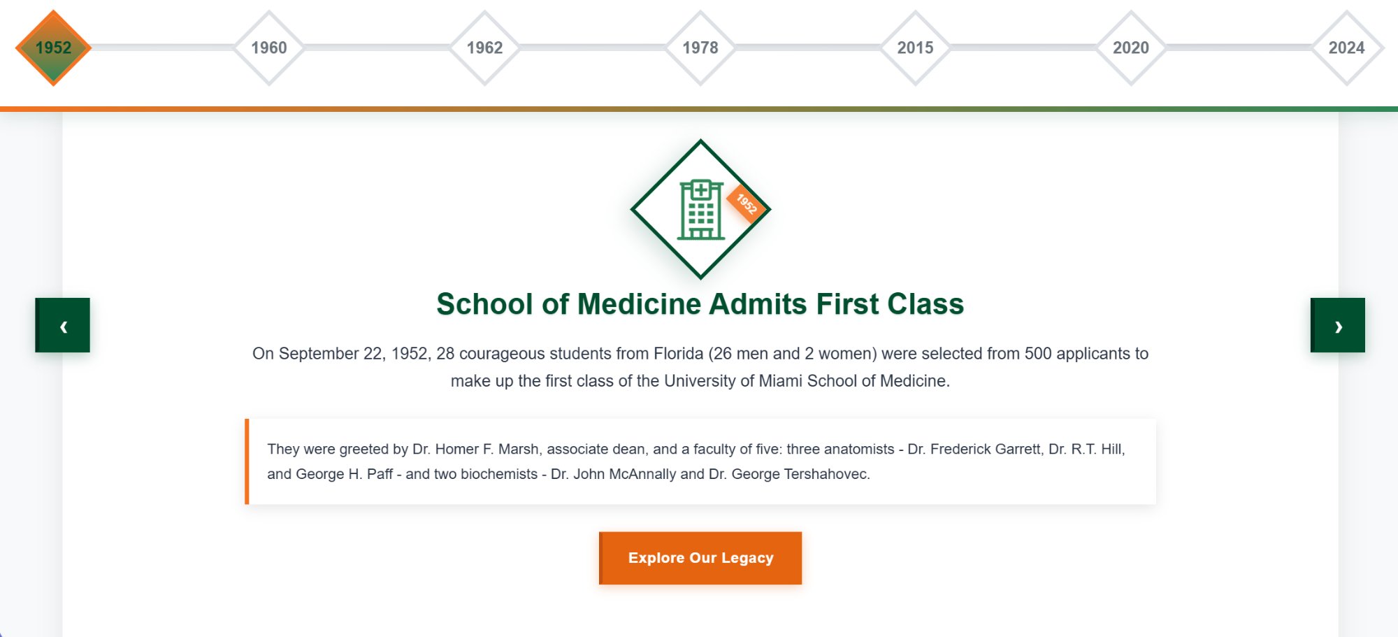
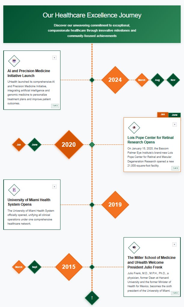
I built the system using semantic HTML5, modern CSS (Grid, Flexbox, Custom Properties), vanilla JavaScript, and GPU-accelerated animations via CSS transforms. Everything was structured as reusable building blocks: navigation nodes, expandable cards, progress indicators, and an orientation switch for horizontal/vertical modes. For UM's request, I developed a conditional month-tab system that appears only when multiple events exist in the same year — requiring dynamic state management and careful debugging.

5

Brand Integration Strategy

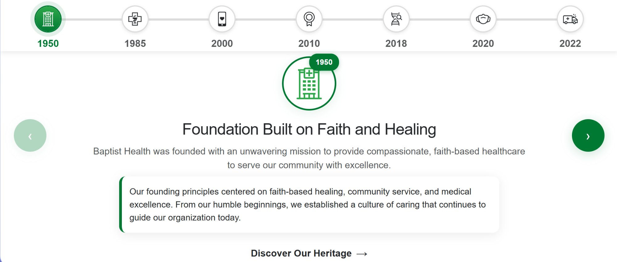
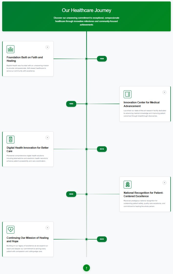
Both clients use green-based color systems. To avoid visual sameness, I differentiated through shape language — circles for Baptist Health, diamonds for UM — along with distinct interaction styling, motion timing, CTA hierarchy, and accent colors. This reinforced brand identity well beyond color alone.

Tools & techniques

High-Fidelity Wireframing

Validated layouts with stakeholders before development

Component-Based Design

Reusable building blocks themed per brand

Progressive Disclosure

Expand/collapse to reduce cognitive load

Mobile-First Development

Designed for phone constraints, enhanced for desktop

Iterative Stakeholder Review

Regular feedback sessions to catch issues early

AI-Assisted Debugging

~30–40% faster iteration, especially for UM architecture

Four timelines. Two brands.
One system.

Each timeline adapts the same core architecture to reflect distinct brand identities — proving the system's flexibility and scalability.

Baptist Health horizontal timeline with circular icon navigation, synchronized arrow controls, and full-width content cards.

Baptist Health

Horizontal Timeline

Circular icon navigation, synchronized arrow controls, full-width content cards.

University of Miami horizontal timeline with diamond-shaped navigation, gradient progress bar, and orange Explore Our Legacy CTA button.

University of Miami

Horizontal Timeline

Diamond-shaped navigation, gradient progress bar, orange "Explore Our Legacy" CTA.

Baptist Health vertical timeline showing zigzag alternating layout with expandable cards and animated progress line spanning 1960 to 2022.

Baptist Health

Vertical Timeline

Zigzag alternating layout with expandable cards and animated progress line (1960–2022).

University of Miami vertical timeline with month-tab navigation for multi-event years, diamond markers, and orange accent states.

University of Miami

Vertical Timeline

Month-tab navigation for multi-event years, diamond markers, orange accent states.

Measurable results

~40%

Faster UM implementation via reusable architecture

AA

WCAG 2.2 compliance across all 4 timelines

<3s

Load time on 3G connections

0

Major revision requests at final approval

What pushed me

⚙️

Month-Tab Architecture

Designing a conditional system that dynamically appears only when necessary required multiple debugging passes. The tab system needed to detect multi-event years and render navigation without breaking the timeline's scroll flow.

Animation Performance

Early builds caused jitter on lower-end Android devices. I refactored animations using GPU-accelerated transforms and optimized repaint cycles to achieve smooth 60fps scrolling across all target devices.

🎨

Brand Differentiation

Two healthcare clients with similar green color palettes. The solution required deeper brand thinking beyond color — using shape language, motion design, and interaction patterns to create distinct visual identities.

Takeaways that changed
how I work

01

Wireframe Before You Code

High-fidelity prototypes dramatically reduce development friction. The time invested in Figma saved multiples of that time during implementation.

02

Design for Variations Early

If I had anticipated multi-event years during the Baptist phase, the UM build would have been even faster. Planning for edge cases up front pays dividends.

03

AI Is a Multiplier, Not a Replacement

AI accelerated debugging and prototyping, but architectural thinking still required deep understanding. The tool amplified my work — it didn't replace it.

04

Brand Identity Goes Beyond Color

Shape, motion, and interaction patterns carry equal weight in differentiation. Color is the starting point, not the finish line.

Reflection

This project reinforced my belief in component-based systems over one-off builds. By designing modular architecture, I reduced duplication, improved scalability, delivered faster second-phase implementation, and strengthened cross-client adaptability. The timelines are now live and actively used by both organizations to tell their institutional stories in a more engaging way.

Next Steps

If I continued this project, I would build a lightweight CMS interface for content editors, integrate user analytics to measure engagement patterns, explore timeline filtering by category, and expand internationalization support.

See it live

Explore the interactive timeline component system in action.

View Live Project